Our Work

Welcome to the official portfolio of XtrudeInc

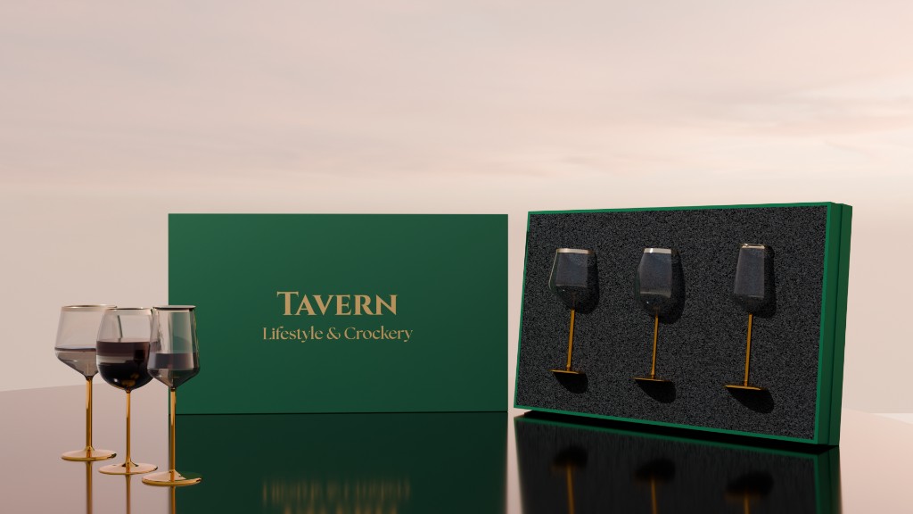
Tavern wine glasses with branded forest-green packaging
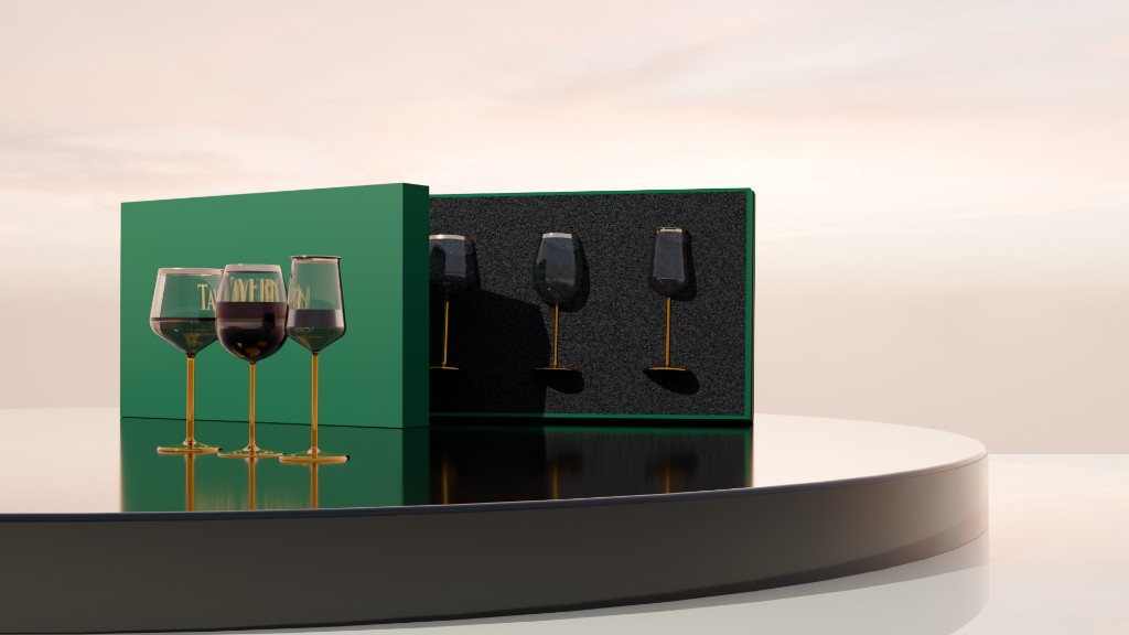
Tavern wine glasses with gold stems and TAVERN branding on the bowls
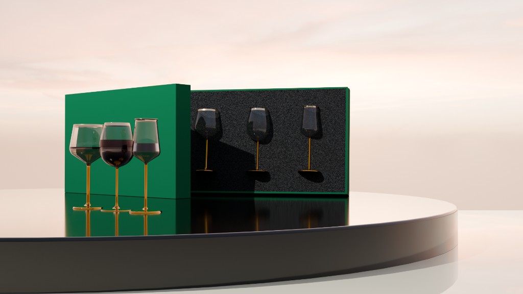
Tavern wine glasses with green-tinted bowls, gold stems, and presentation boxes
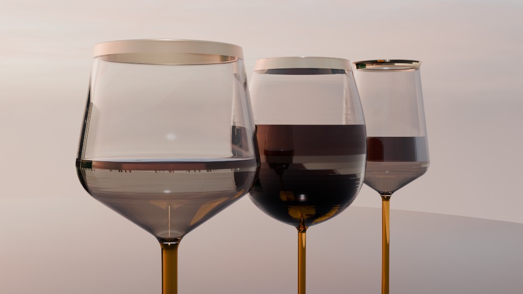
Three Tavern wine glasses with amber stems and gold rims
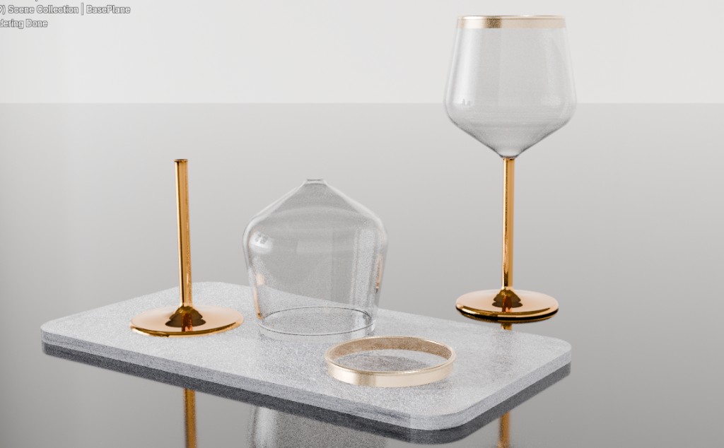
Exploded assembly of a Tavern wine glass showing glass bowl, gold stem, and stone base

Tavern Glassware Collection #1 - Wine Glasses

Category: Product visuals

Created By: Sai Prakhya

View profile on linkedin: Link

This case study looks at how luxury products are designed for premium perception, using the Tavern wine glass collection as the subject. The work is not only a set of product shots. It is a study of how form, finish, and presentation can make a familiar object feel exclusive before anyone holds it.

The collection uses unconventional material choices on purpose. Gold-toned metal stems and rims replace the usual all-glass build. Bowls shift between clear, smoked, and green-tinted glass. Packaging sits in forest green with a custom foam insert, and assembly views isolate stone, metal, and glass as separate parts. Those decisions change how the brand is read: less household tableware, more crafted object.

The renders test that perception in stills. Hero shots, family views, branded bowls, and exploded assemblies show how the same design can be sold as a product, a gift, and a study in materials. The brief is to understand how those choices raise brand perception, and how visualization lets a luxury line be judged before it is manufactured.
Enquire about this post
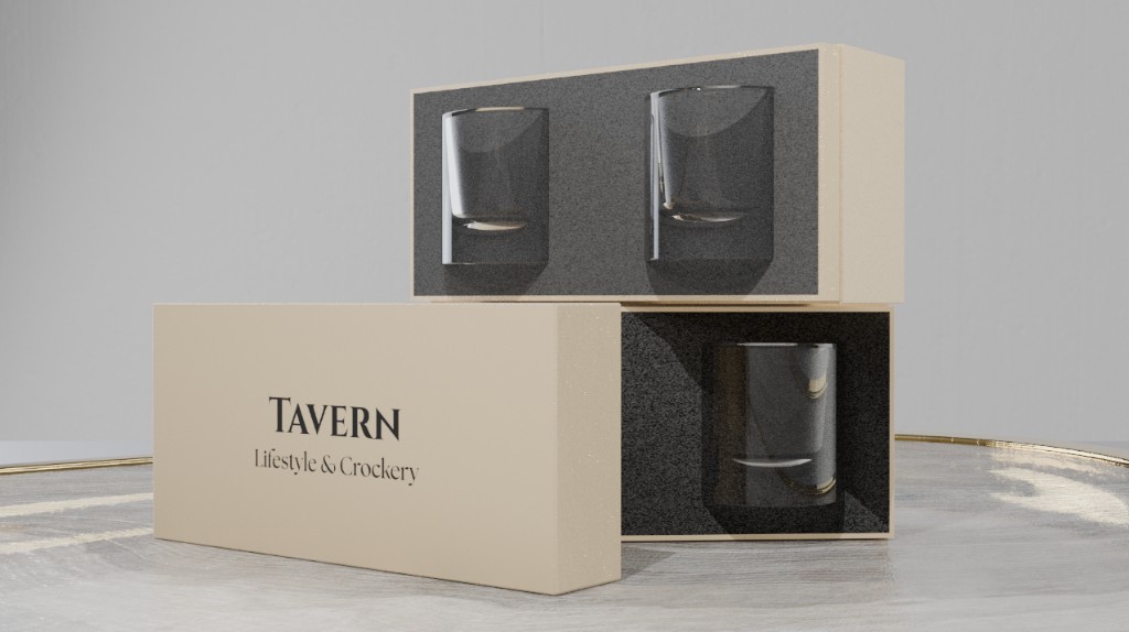
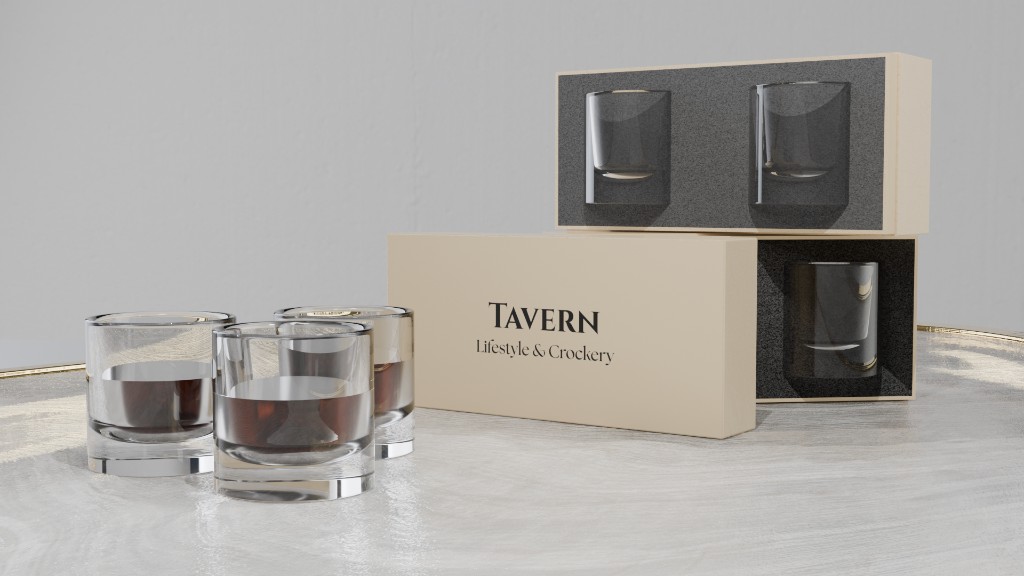
Tavern whisky tumblers with cream packaging and poured whisky
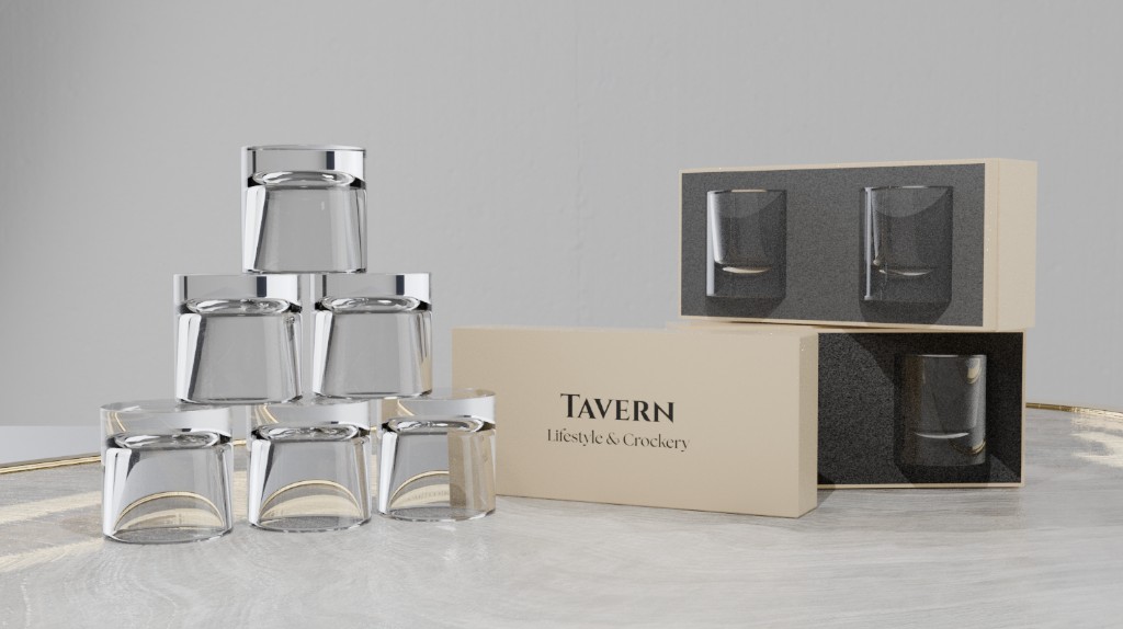
Stacked Tavern whisky tumblers beside branded cream boxes
Tavern whisky tumbler packaging with foam insert and cream boxes

Tavern Glassware Collection #2 - Whisky Tumblers

Category: Product visuals

Created By: Sai Prakhya

View on LinkedIn profile: Link

This case study explores minimalism and seamless transition design through the Tavern whisky tumblers. The brief is simple: a heavy, clear glass with no extra ornament, so the object reads as one continuous form rather than a bowl sitting on a base.

The silhouette is a clean cylinder that thickens into the foot without a visible join. That uninterrupted line is the design. Highlights run down the wall and into the weight of the glass, which is how the renders test whether the transition feels seamless in stills as well as in the hand.

Packaging follows the same idea. Cream boxes, charcoal foam, and a quiet TAVERN mark keep the set spare. Stacked glasses, poured whisky, and open gift boxes show how a reduced language can still feel premium: fewer parts, one material story, and a transition that does not need decoration to hold attention.

Enquire about this post
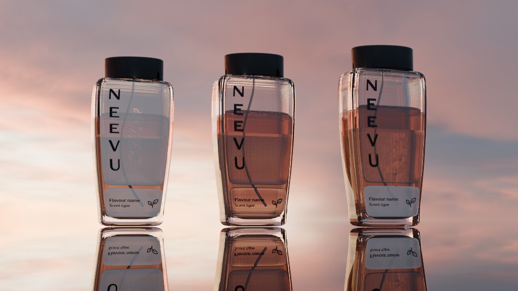
Three NEEVU perfume bottles of different heights on a reflective surface
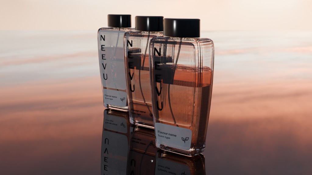
Three NEEVU perfume bottles in a diagonal lineup at sunset
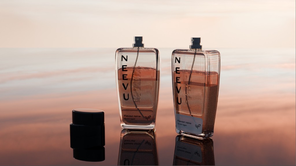
Two NEEVU perfume bottles with a black cap on a reflective surface
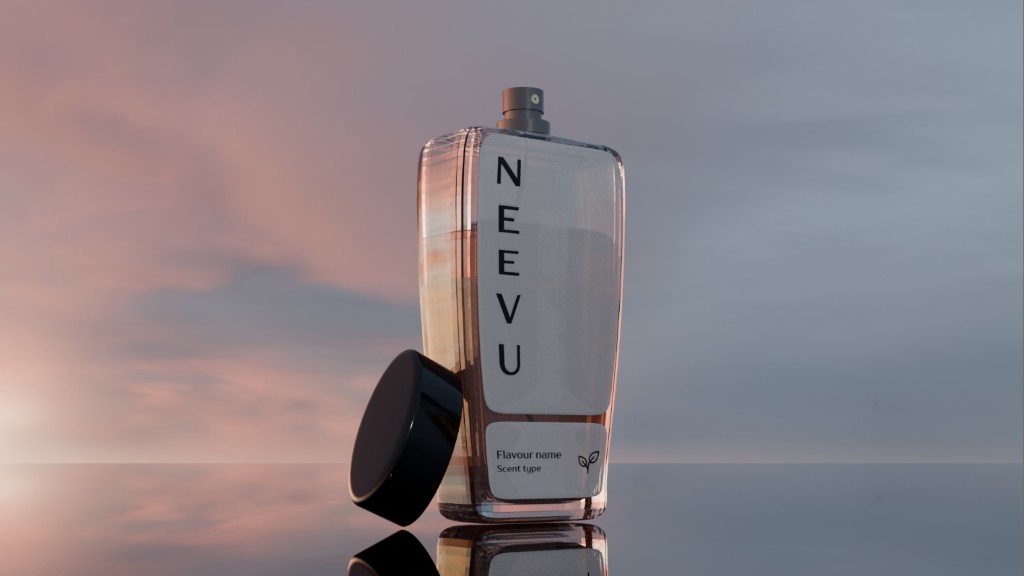
NEEVU perfume bottle with vertical branding and a white label
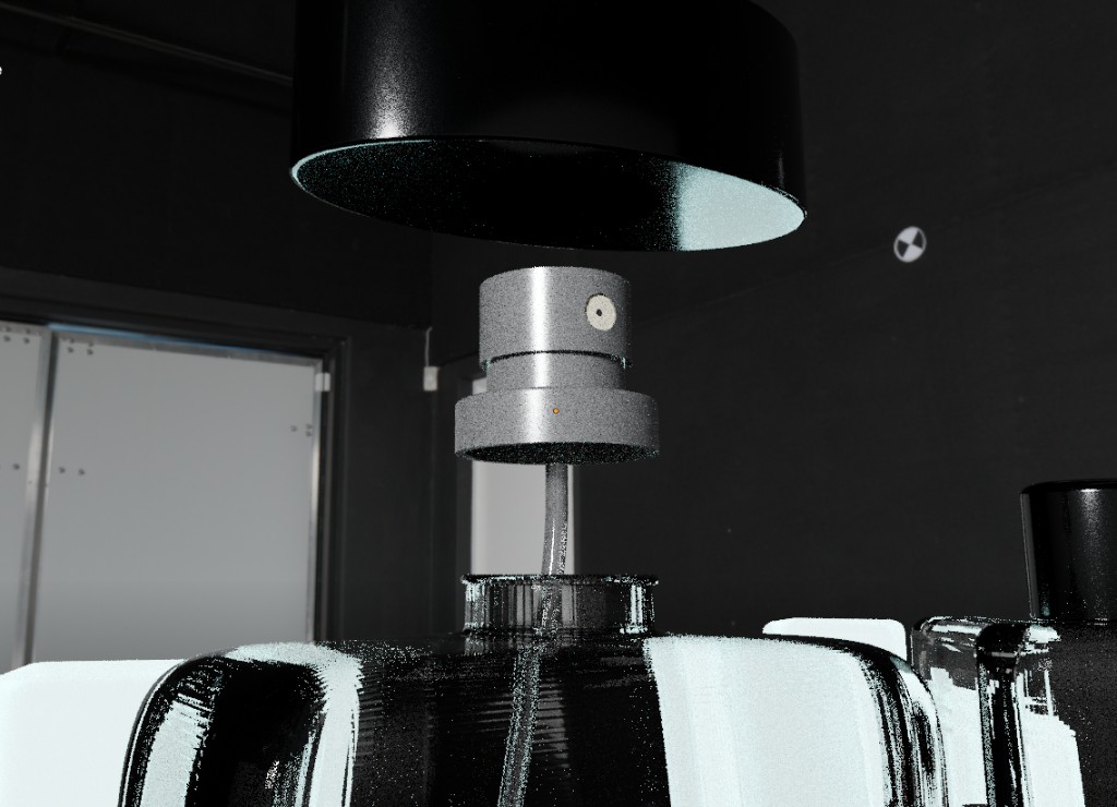
Close-up of the NEEVU perfume atomizer, cap, and bottle neck

NEEVU Perfume bottle visualization

Category: Product visuals

Created By: Sai Prakhya

View on LinkedIn Profile: Link

This project was made to explore how packaging changes premium perception on lifestyle products like perfume. The bottle is the product, but the cap, label, type, and how those parts are shown together decide whether it reads as a fragrance or as a luxury object.

NEEVU is tested as a family of forms: tall and short bottles, a black cap off the neck, a vertical name, and a small flavour label. Each still asks the same question: does the packaging lift the glass, or does the glass carry the brand on its own.

Hero lineups, label close-ups, and an exploded atomizer view separate the packaging from the liquid so the difference is easy to judge. The work is a study of how a lifestyle scent becomes premium when the vessel, the mark, and the finish are designed as one package.

Enquire about this post
Refined industrial Vivo T4x from back, front, and bottom
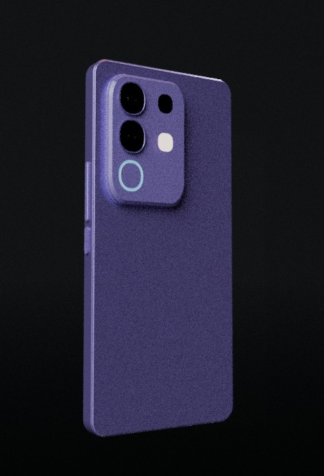
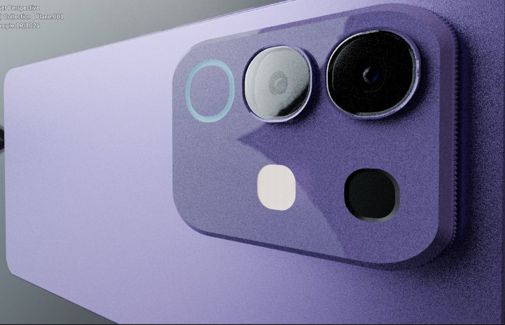
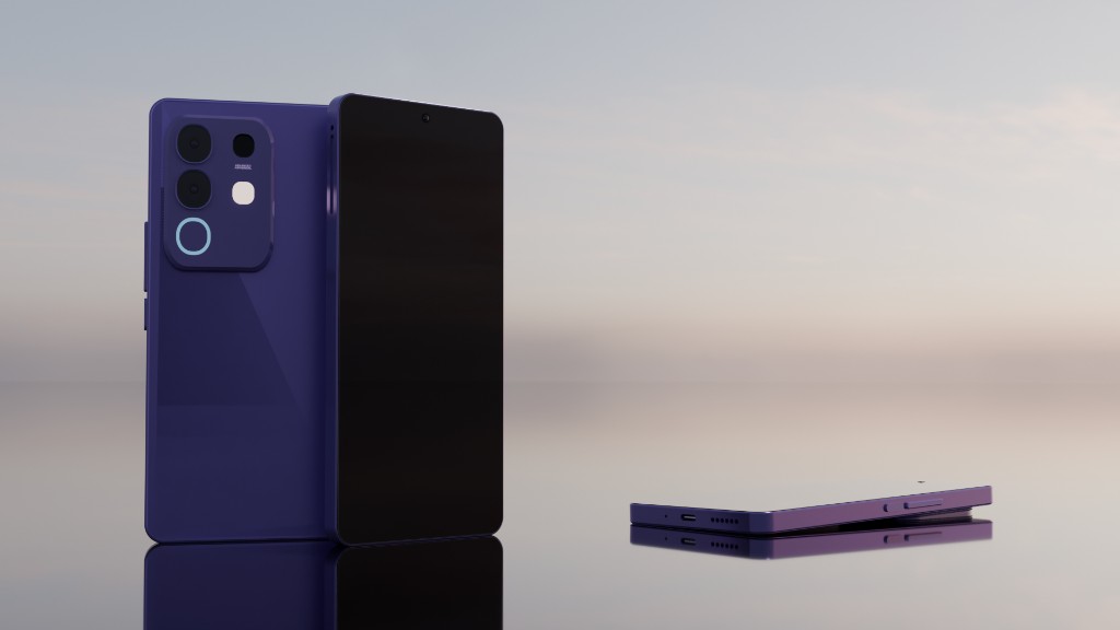
Purple Vivo T4x original rear concept render
Close-up of the purple Vivo T4x original camera island
Purple Vivo T4x original model from front, back, and side
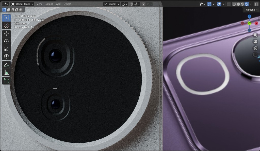
Side-by-side of the industrial camera module and the purple original
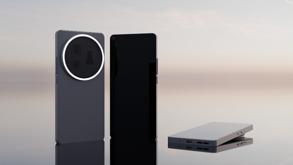
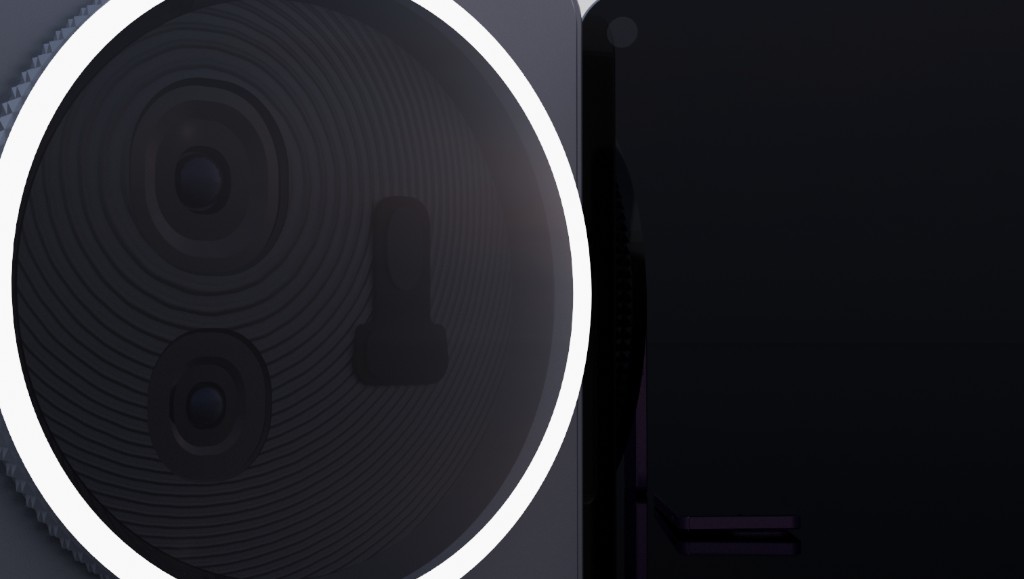
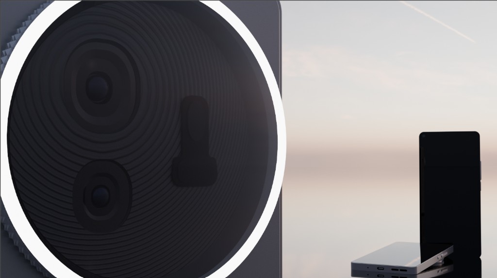
Close-up of the redesigned industrial camera ring and lenses
Vivo T4x industrial redesign hero with camera ring and full device views

Vivo T4x Concept Render

Category: Product visuals

Created By: Sai Prakhya

View on LinkedIn profile: Link

This case study starts with the purple original Vivo T4x model and redesigns it into a more minimalistic, sleek, and industrial premium product. The brief is brand perception: keep the phone readable as a Vivo, but make the object feel quieter, heavier, and more considered.

The original rear is a glossy purple slab with a rectangular camera island. The redesign drops the colour story and rebuilds the camera as a circular module with a knurled metal rim and a thin light ring. Surfaces go from shiny plastic to matte charcoal. Edges stay flat. Ornament is reduced to the ring, the lenses, and the silhouette.

Family views, camera close-ups, and a split with the purple original show the jump. The work is a study of how a mid-range phone can be recast as an industrial object so the brand reads more premium without adding more parts, only better ones.

Enquire about this post
← Back